The City of Fishers’ logo visually captures our vision for a smart, vibrant, and entrepreneurial Fishers while embracing the future and paying homage to past.
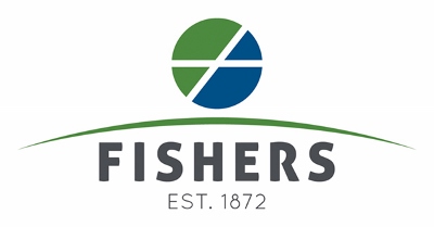
The Icon
The icon element of the new logo pays homage to the Fishers’ flag. The green, blue, and white colors of the flag represent the fields, waterways, and infrastructure of Fishers, respectively.
Specifically, the white of the flag represents the intersection of I-69 and 116th Street. The “116th Street” bar has been extended from one side to the other to represent the growth in Fishers over the years. In addition, the white crossbars of the icon are left open, without an endpoint. This represents the welcoming, open culture of the City of Fishers, as well as the continued growth expected over the next several decades.
The Horizon Line
The horizon line represents the future of Fishers. In literature works, the horizon has exemplified the possibility of greatness, better things, or change in general. As the city moves forward towards the vision of a smart, vibrant, and entrepreneurial city, the horizon represents this process and the culture of challenging the status quo that has become synonymous with Fishers.
Typography
Fishers is spelled out in the logo with a font that is has straight lines, a block shape, and rounded endpoints. Notice this specific font doesn’t touch in some letters, such as the “R” in Fishers. This further represents the openness of the community. In addition, the block, rounded shape represents a solid foundation with a well-rounded, balanced governing body. A dark gray color was chosen for Fishers to “root” the logo with a neutral, grounded color.
Established in 1872 – This element is a tribute to the history of Fishers and communicates that the community is well established and woven into the fabric of central Indiana.
Download the official logos and the Official Logo Style Guide (PDF) to ensure proper use.